- Vol. 07
- Chapter 06
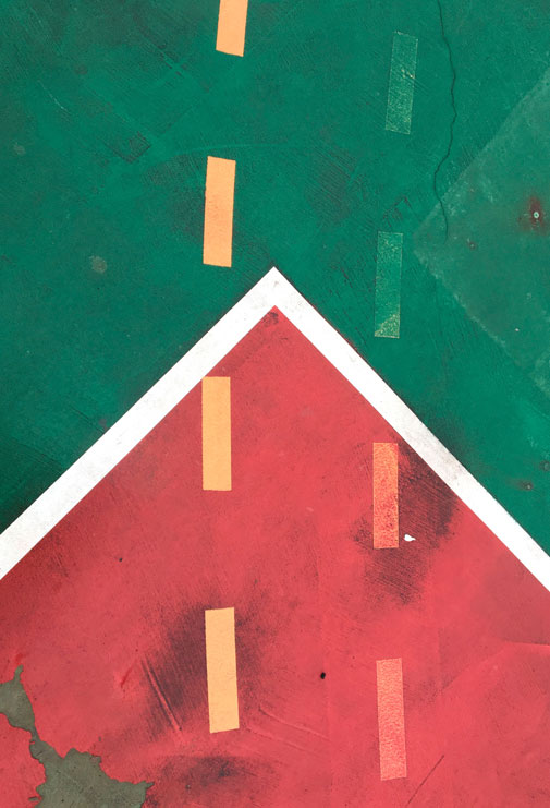
In Consideration of a Flag
These inconsiderate invaders and their ultra-modern art ideas have desecrated our national banner. And made my head spin as I try to take it all in. Like almost all flags, that of Portugal is a rectangle, and like so many others it has two colors, that's called bicolor, in this case green, on the hoist side, and red, on the side that flies and flaps in the wind. And there's a more modest coat of arms of the nation (we have large and medium sizes) that sits where the colors meet, the meeting forming a dividing line, a boundary, centered between top and bottom. And all this horizontal attention to chromatic constitution and disposition and upper and lower edges has been turned into something else and rotated right and it's not right. What's left of the flag's native grace and dignity? It has been taken to the ground, besmirched, stepped upon, sullied, dirtied, stained, discolored, and collaged with who knows what, and the seal has been unfurled and broken down into broken lines as if for a highway where passing is permitted, and the red, though suffering the most apparent injury, has taken some territory from the green, and made some think there is some historical symbolism and others that some sort of painterly favoritism is at work. Red's advance is capped with an angled white line in the shape of an arrow, ninety degrees actually, that keeps its character separated from the verdure. And that is the toughest break and change to take. The illusion of a trek for the better is a graphic delusion, the traffic for us is a vehicle to dismantle an original unity. So it's not cute and there will be no salute.